CASE STUDY – 2024
Location feature
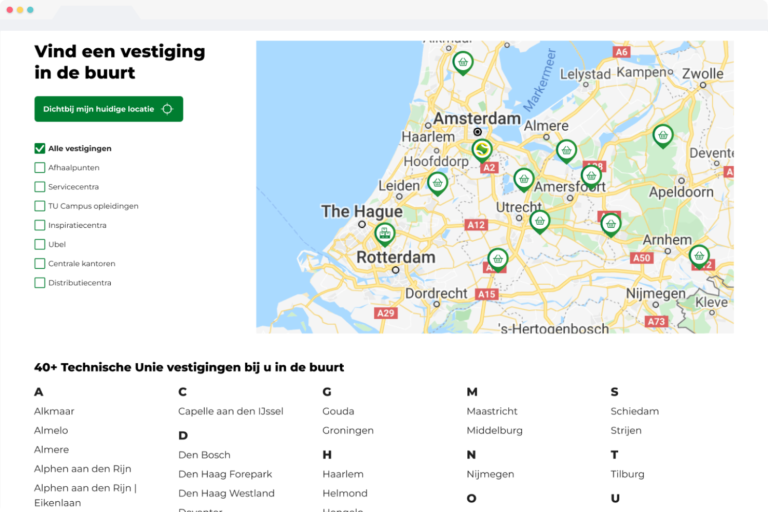
Finding the address of the nearest shop is key when on the way to pick up the tools and materials needed for a job, but this functionality was lacking in the locations feature. I redesigned the locations feature to improve usability and increase discoverability.
MY ROLE
UX design
Visual design
A SNEAK PEEK
WHY REDESIGN?
Technische Unie has locations throughout the entire country that offer various services to their customers. However, user insights revealed that many customers were struggling to navigate through the locations feature effectively.
The issue? The existing interface failed to clearly distinguish between different types of locations and the services they offer, making it unclear what information is relevant and leading to frustration and unnecessary customer support.
Moreover, we observed a discrepancy in user behaviour between those using the interactive map and those relying on the alphabetical list of locations. This inconsistency further contributed to confusion and frustration among users.
Join me on this journey to redesign the locations feature, striving to improve usability and increase discoverability.
THE SOLUTION
Finding the right location
In redesigning Technische Unie’s locations feature, my focus was clear: to make finding the right location an effortless and intuitive experience for our users. Here’s how I achieved this:
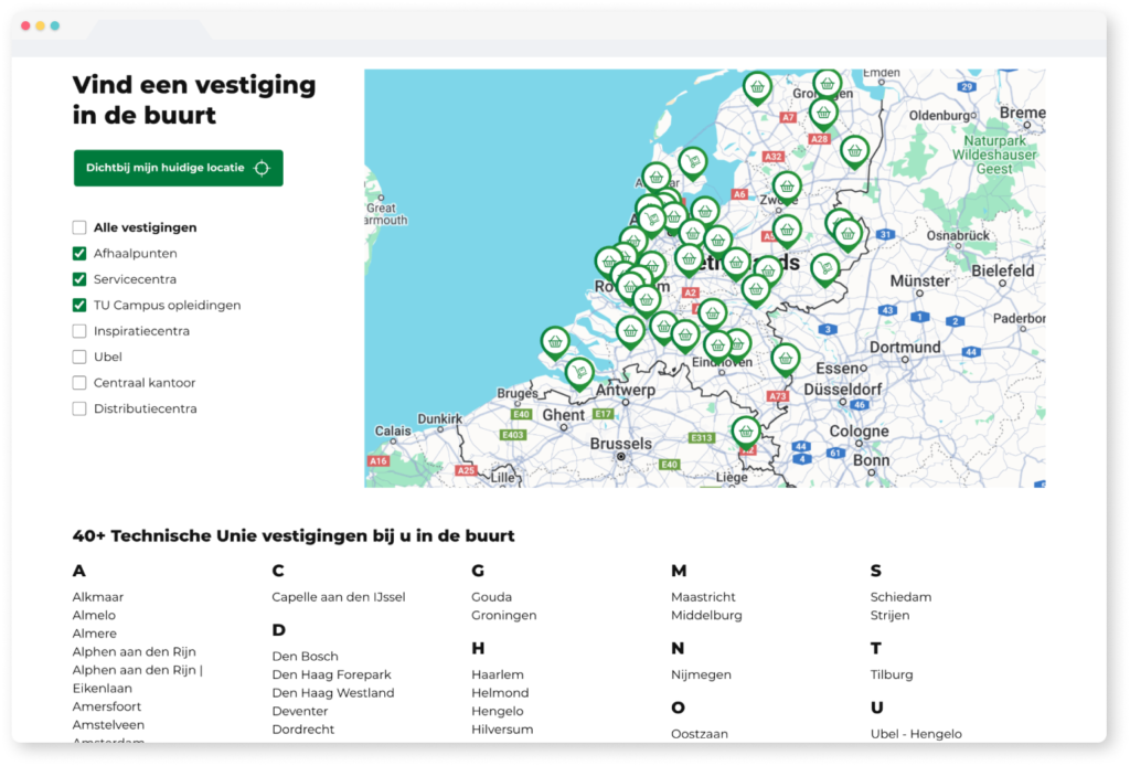
Implementing location filters
By simply selecting a checkbox, users can easily filter locations corresponding to their desired category
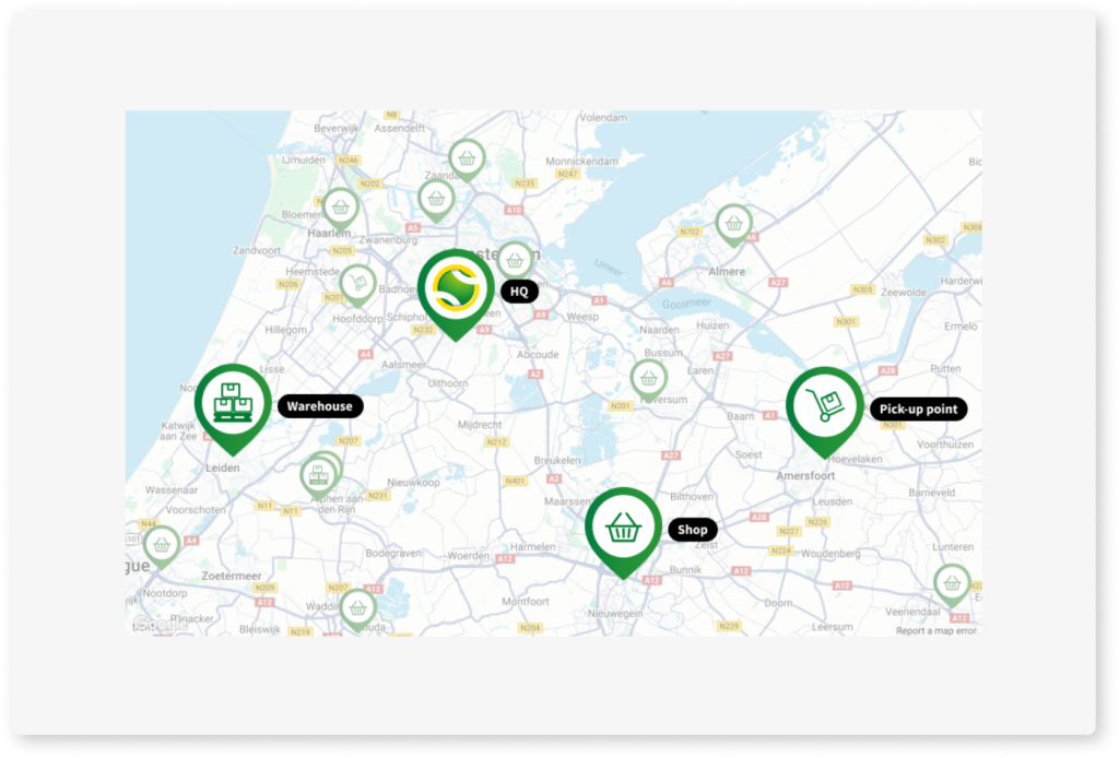
Introducing recognisable icons
Distinct pins with icons, corresponding with the location filters, to indicate what services the location offers
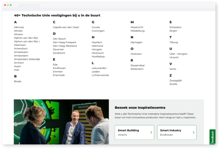
Creating clarity
Recognising that shops are a primary point of interest for most users, I prioritised their visibility by displaying them in an easily scannable alphabetical list.
To provide more clarity and organisation, the other locations were grouped into visually distinct, separate sections. Each containing clear copy and call to action.
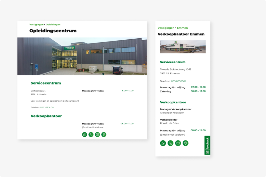
Before
Impression that multiple locations are displayed, unclear hierarchy, hidden contact information & navigation button
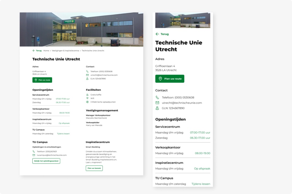
After
One location that offers multiple services, better hierarchy through grouping and font usage, clear contact information & navigation button
Designing with user-centered cases in mind
Determining and ranking the use cases for the locations feature pointed out the lack of consideration for mobile users. The use cases identified provided valuable insight into the various needs of our users:
Users on the go
Users frequently rely on their mobile phones to look up the address of their local shop when picking up tools and materials for their jobs.
On the job assistance
Users often find themselves in unfamiliar areas while on a job and need to locate the nearest shop to get necessary supplies.
Customer support
Users may need to contact a sales office with questions about their order, requiring easy access to contact information
To address these use cases, several design decisions were implemented:
Prominent ‘Find a Location Near Me’ Button
Recognising the importance of quick access to nearby locations, I placed the ‘Find a location near me’ button in a more prominent and accessible location on the page. This ensured that users can easily locate nearby shops with just a tap.
Convenient ‘Plan Your Route’ Button
Understanding the need for efficient navigation, I positioned the ‘Plan your route’ button directly underneath the address. Placing it within the viewport upon opening the page or preview ensures that users can easily plan their routes to the desired location, without unnecessary scrolling or searching.